Having graduated in the late 1980s, I can appreciate how graphic design and its associated industries have evolved over the past 30 years. The shift from analogue to digital was, at the time, unwelcome for many sectors of the industry as century-old craftsmen and their guilds were in fear of their future existence.
The original Macintosh computer was launched in the mid-1980s but was so expensive and complex that only large professional agencies could afford to purchase the hardware and find training for their staff. The problem with owning a Macintosh back in those days was that being a member of such an elite club meant that your work often could not be read by IBM’s operating system – the company that had the monopoly to the office-based desktop computer market. A regular question was… “are you MAC or PC?” And the maximum portable storage size was a 1.5mb disk - not enough space to store a single mp3 file!
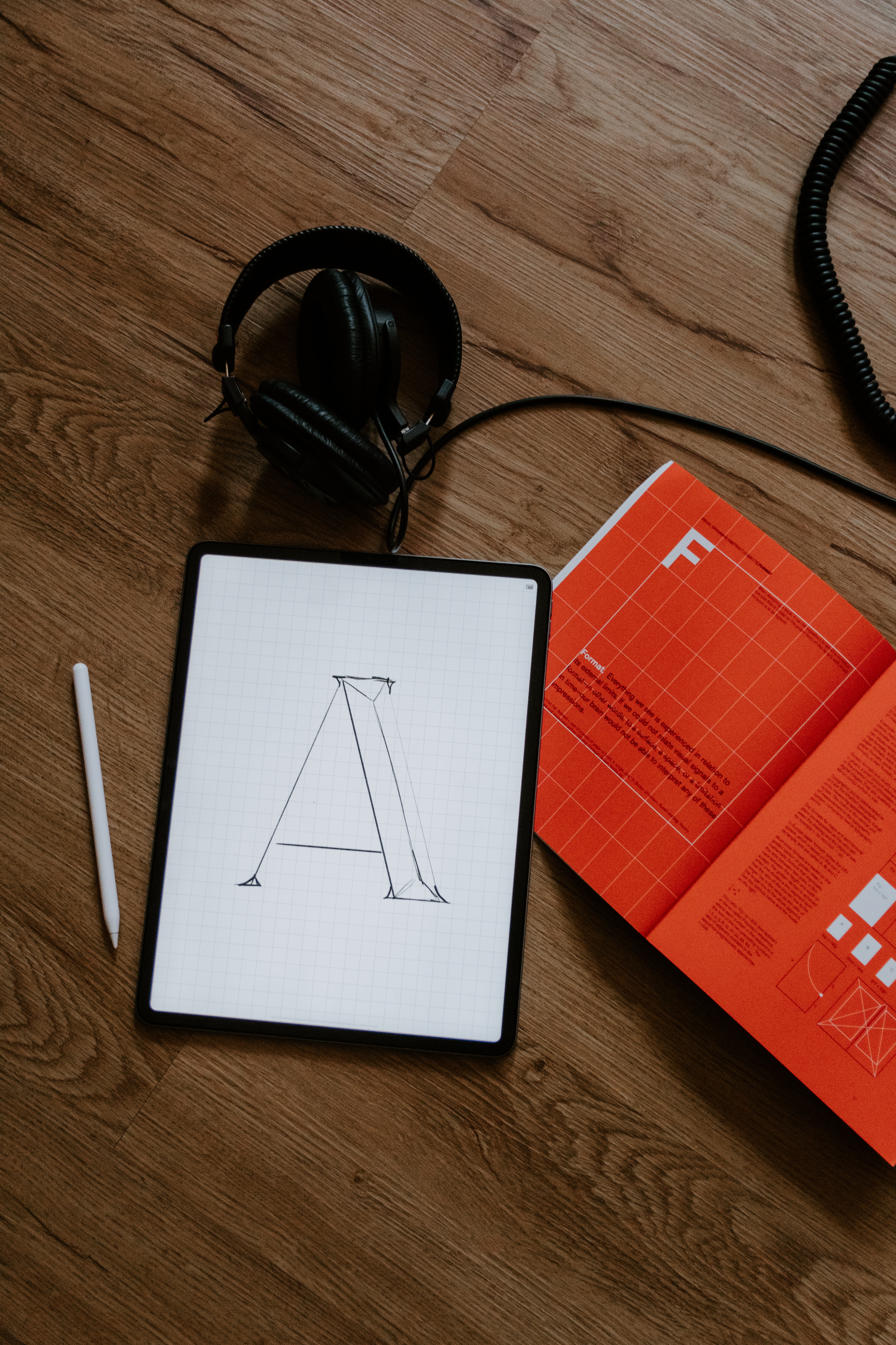
Typesetting
Back in the day, the designer couldn’t just pick a typeface from one of the hundreds on his laptop. He would have to trawl through catalogues supplied by the type setter and select a type from their limited collection. Then, he had to specify the size, style, leading, line length etc., using a very complex-looking type ruler scale. This would then be faxed over to the typesetter, who would virtually code the information into the Linotron or Compugraphic typesetter that had a small green coloured screen.
These skilled craftsmen knew they were priceless to the industry and often treated the designer as ‘the idiot’! They would always play it by the book and give you what you asked for in your type specification – it was not their job to make corrections or edits. They didn’t care if you had mistakes in your body text - that would be your fault for not specifying it correctly! Whereas the designer would often have to work through the night to get the job completed, the typesetter would take their obligatory break every 20 minutes or so, regardless of the designer’s tight deadline!
The Studio
Once completed, the typesetter would send the galleys of black on white type back to the designer - usually by motorcycle courier - sometime during the following day. When received by the designer, it would then need to be hot waxed and applied to an artwork board. The type was then cut (with a scalpel blade) and pasted onto the artwork board (this is where the terms Cut & Paste comes from). Rarely did the type fit the artwork precisely, so the designer would have to cut and slide characters or words to make it fit. The designer’s curse was when a freshly cut character would fly off the end of his scalpel blade, never to be found again during the production of that job… but to be found weeks later, stuck to the underside of the parallel motion ruler on his drawing board!
SprayMount (other brands were available) was introduced to the design industry in the mid 80’s to replace wax for the purpose of art working. Although this was a quick fix to get elements onto the art board, the health and environmental implications of four designers working industriously in a small room, all spraying glue in the air, were - as you can imagine - unimaginable. Your clothes were sticky, your feet were stuck to the carpet and as for your lungs… well, let’s not go there!
Artwork was produced in black and white and photographs would need to be broken down into printing dots by using a very large copy camera in a darkroom. It was a dark, smelly place, where large sheets of light-sensitive photographic paper could only be exposed under a red safety light.
Photography
Photography was a booming trade until the introduction of the digital camera and later the smartphone. You rarely met a poor photographer back in the ‘90s - they drove around in big 4x4s or flashy sports cars and were looked at as the playboys of the industry.
The cost of photographic materials was insanely high - as was the processing. Some photographers would process the films themselves, but most would send them to a lab, which again ate into your production time. Whereas, today, we take several shots of the same image with digital devices, photographers used Polaroid backs to their cameras, where they could have an image available within a few minutes to check on composition, lighting etc.
A few days later, you would receive some sheets of transparent film strips (slides) to view with a magnifying eye glass on a light box. When you had chosen your image, you would then have to make a drawing of the composition so that the reprographic house would know what you were trying to achieve. The slide would be attached to the artwork overlay on top of your sketch. The transparent slide would then be scanned on a half a million pound drum scanner to a high resolution of 300 dots per inch. The cost of an A4 scan was around £30 and an A3, £50… so in comparison to the flatbed scanners we have at home on our desks, this process could rack up a very expensive bill - especially if you were producing a catalogue!
The job would come together at the reproduction house, where staff would take your artwork and all the instructions, and separate the artwork into the four process colours on large acetate film sheets. From the four acetates (CMYK), they would produce pre-press photographic proofs. It was down to the designer to then check the proofs for colour, accuracy. The repro house would require the designer to sign-off the proofs as ‘good to print’, so there would be no comeback on them if there was errors in the job! Once the proofs were signed off, the repro house would produce printing plates from the films, and from these plates we would finally, belatedly, get our printed copies
Phew! What a palaver! So you can see how far we have come in such a short space of time. When you hear someone say “cut and paste”, we really did have to do that - literally!
Reflective Writing